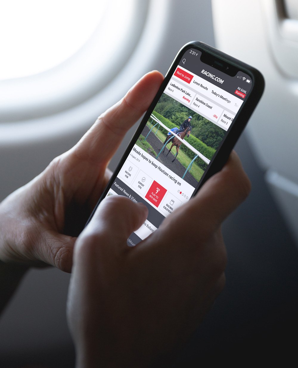
// racing.com
Your racing connection with an all new look, enhanced features & experience.

Racing.com is Australia’s leading thoroughbred media platform with a reach of 95% of Australians through their free-to-air channels. Alongside their broadcast they offer digital content via the Racing.com website, msite & app. Followers of thoroughbred racing consume all kinds of content, from form & analyst to news, video and profiles.
Previously, the Racing.com app was available on iOS only and had a confusing navigation structure with a slow response time which lead to a downturn of users. The previous app rating on the Apple App Store was 2.1 stars out of 5 with a lot of negative reviews on the usability.
The nature of this project was to deliver an enhanced customer experience on Racing.com’s mobile Apps (iOS & Android) with a new design and framework architecture. Since the release, Racing.com’s total year-over-year session and user growth figures for web and app are sitting at a remarkable 25%.
Racing.com’s app peaked as the #2 trending app in Australia and currently has a 4.6 rating on the Apple Store. It also was awarded silver in the Melbourne Design Awards.
A final note, a massive thank you to the other contributors on this project - Our Very Own & We Are You.
The Project

To deliver on the key project goals and core objectives, a tailored UX program was defined to validate user needs, all while ensuring continuous delivery of the designs for development. Part of this process was to continually develop the app wireframes based on feedback received from the UX process.


Seamless navigation
One of the key issues commonly raised in the previous app edition was the navigation. During UX testing a high percentage of users found issues in form and navigating the latest news making the app very one dimensional.
When restructuring the new app we arranged everything under a new pillar system whilst making live racing a focus. With this architecture in place, it made everything one or two taps away, compared to multiple in the previous app. The results of the beta navigation test overturned and the majority of the users found it a lot easier to navigate to their desired content.

Icon font set
An icon font was developed to help alleviate the issue of pixelation across different screen sizes on the iOS & Android platform. This allowed the app to be consistent on different screens, including iPad so it wouldn't hinder the user's experience. The font consists of 70+ icons which were created in Adobe Illustrator.


Have an idea? Let’s work together
Whether you have an idea, a vision or simply a question to ask, feel free to get in contact with us. We're enthusiastic about collaborating with you, regardless of the scale of the project.