// Fittipaldi Injury Lawyers
A Melbourne based law firm required a fresh new identity after renaming their business.
The Project
Fittipaldi Injury Lawyers, a Melbourne based law firm required a fresh new identity after re-launching their business. With a previous history, the company understood the importance of having a compelling brand to stand out in this competitive industry.
The brief for this project was to make the brand feel grand while tying it back to the industry. The use of a bold serif font provides a strong appearance and pairing this with the selected colour scheme gives off a grand royal feeling. The F icon created represents a pillar which is commonly related to a courthouse and once again, this shows a sign of strength.
Fittipaldi Injury Lawyers needed their new brand to work across many mediums, from print to digital. In relation to this, we created a vertical and horizontal logo suite so the brand could adapt to any platform without any restrictions.
Brand application
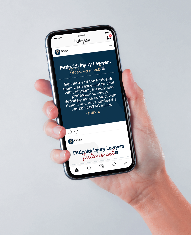
Applying the brand consistently across many mediums was a key driver to create a footprint in a competitive market. The first part of the transition was to create the items for everyday use, such as letterheads and business cards. Larger items notably print advertising material, social templates and a complete overhaul of the responsive website then followed.
Have an idea? Let’s work together
Whether you have an idea, a vision or simply a question to ask, feel free to get in contact with us. We're enthusiastic about collaborating with you, regardless of the scale of the project.


